"Accessible design is good design - it benefits people who don't have disabilities as well as people who do. Accessibility is all about removing barriers and providing the benefits of technology for everyone."
Steve Ballmer, former chief executive of Microsoft.
We care about accessibility
There are over 11 million people in the UK with a limiting long term illness, impairment or disability [1]. These disabilities can include issues with memory, concentration, or physical coordination that make every day tasks such as reading or typing more difficult. Teachers care about the overall wellbeing of their students and want to ensure every student in their class has the same chance to learn.
Just like teachers, Firefly cares about accessibility. As the use of technology and web applications in education grows, classroom tools need to adapt to different learning styles and needs.
We think about accessibility as a form of inclusion. We have the responsibility to ensure that teachers, students and parents with any range of physical and cognitive abilities and social circumstances can use Firefly successfully.
Improving accessibility
Technology can provide disabled people with a better and more independent access to education. To build accessible e-learning materials, Firefly has to start with the platform itself.
Our iPhone and iPad apps already support accessibility features essential for the visually impaired, such as the screen reader, zoom, high contrast and even braille display.
We’ve brought many improvements to Firefly on the web, too:
- Users who can’t use the mouse or prefer a keyboard can navigate between form fields and drop down menus with the tab key.
- Alerts are indicated with colours and changes of border thickness, so there are multiple visual cues to help those who can’t distinguish colours.
- People using screen readers will experience continual improvements.
Colour contrast and legibility
One of the main pillars of web accessibility is visual usability and readable text. One element of readability is colour contrast between the text and the background. The example we will explore shows how everyone can benefit from well considered accessibility, not just those who are visually impaired.
Low text colour contrast:
- can be completely illegible for people with visual impairments, such as colour blindness, which is common and affects up to 8% of men and 0.5% of women [2].
- creates unnecessary eye strain, especially after spending more time in front of the screen.
- can affect everyone at some point in their lives - contrast sensitivity is influenced by other factors such as age, mood, and common disorders, like depression or anxiety [3].
Text colour changes to Firefly
Schools with the Plus and Unlimited packages can customise Firefly’s colour palette, so we already try to ensure a reasonable level of contrast for text by making it slightly lighter or darker where necessary.
We’re now complying with the minimum contrast ratio requirements as they’re defined in the Web Content Accessibility Guidelines (level AA). Because colour perception can be relative, we use use an objective way of verifying it - a mathematical formula.
“Providing a minimum luminance contrast ratio between the text and its background can make the text more readable even if the person does not see the full range of colors. It also works for the rare individuals who see no color.”
Understanding Success Criterion 1.4.3 | Understanding WCAG 2.0
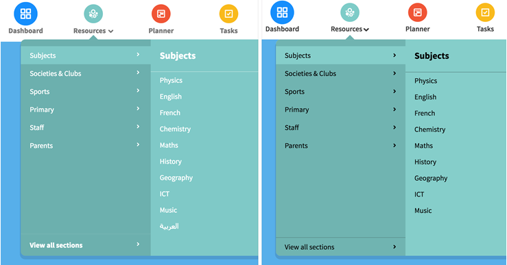
We’re introducing these changes first in the Firefly navigation menu. Some of our users might notice that the text colour has changed, depending on the colours used in their school’s Firefly theme settings.
When the contrast between the text and background isn’t high enough, the text colour changes to either black or white. This change provides the best possible contrast and improves readability for the background colour that was chosen by the school. We want the design to work for everyone, with colour selections that help schools maintain good aesthetics.

Caption: In this example, the new navigation text colour (on the right) improves the contrast ratio by more than six times.
Change to font colours in the navigation is one small, but important, step forward on our road to better accessibility. Firefly will continue working on this area, making it easier to use with screen readers and making more readability changes.
We're constantly improving our product and look forward to working with you to make Firefly useable for students and teachers of all abilities.

